Overview
This project was part of our User Experience Design Experience Studio class, where we work with companies to complete a project throughout the semester. This project was sponsored by Crema Labs. The following was the problem statement:
Customers find it difficult to decide what to do on a night out with friends, such as where to eat or what to order.
The goal for this project was to apply customer research insights and findings to develop new ideas, thoughts, perspectives, and designs for the product and to provide visualizations of those recommendations.
Quick Rundown
What I Did
Conducted an online survey to learn about our users and their habits
Contributed to the ideation process based on findings
Contributed to the development of the task flow
Contributed to the development of wireframes
Contributed to the development of high fidelity mockups
Contributed to the design and development of presentation and documentation
What I Used
Apple Keynote
Adobe Photoshop
Adobe Illustrator
Sketch
Figma
String
String is a conceptual mobile platform for people to explore a string of curated experiences in cities around the world and to share their inside stories to the great locations in their communities.
When we started this project, the concept for String was in an early phase of development.
The Process
We followed a hybrid management style of waterfall and sprint. Ultimately, this style consisted of four main stages: Research, Ideation, Testing and Prototyping. Each stage a few sub stages that helped us progress the project forward and made sure we captured everything that we needed. As a waterfall style, each stage built upon the last, allowing us to directly use our findings and implement them in the next phase.
Research
In order to successfully know our audience and their habits when using apps like Yelp and TripAdvisor, we dove into both Primary and Secondary research.
Our research consisted of
A survey, which focused on gathering user information, their familiarity with ratings and recommendation applications, and the frequency in which they use these apps. The survey was developed through Qualtrics and distributed using social media.
Interviews, which were based around our findings of our survey and were more targeted towards the relationship our users have with rating and recommendation apps.
Literature Review, which allowed us to compare and contrast our findings from both the survey and interviews with previous research that had already been done.
Our research methods ultimately led to the creation User Profiles, a way for us to label our users to help us design for them.
Survey
The goal of the survey was to gain a better understanding of app familiarity, app usage, what they tend to use the apps for and basic information about our users.
Qualtrics, which is supplied through Purdue University for Students, was used to create and distribute the survey. This was then sent over various social media, like GroupMe and Facebook, and email for our users to take. In total we had 150 users complete our Survey.
User Information
How often do you use recommendation and rating app(s)?
Which of these apps have you used before?
When do you most often use recommendation and rating app(s)?
Summed up, We found that our users are most familiar with applications such as Yelp and TripAdvisor, using them every few weeks, while they are both in the role of a local and a traveler.
Interviews
Using our Survey data as a basis for our interviews, we were able to hone in on things that we found interesting and useful. We were quite lucky with our situation as we were on a college campus. Most of the Students here are not local, therefore fit in our pool. On the other hand, one of our group members was from the Lafayette area and had connections to help on that side as well.
We asked general demographic information, like Age,Occupation and employment status, but the focus of our interviews were on the applications like Yelp. This interviews were semi-structured in nature and allowed us to ask follow up questions if we wanted to pursue an avenue further.
Looking through our interviews, we found four major takeaways
Trust
Users mentioned multiple times throughout interviews that they tend to place a high level of trust in recommendations from friends, trusting those recommendations over anonymous online reviews. They feel that their friends, being similar to themselves, would make good recommendations.
Planning
In multiple instances, interviewees brought up that they like to create an itinerary for their day, particularly while on a trip, using rating and recommendation apps. One interviewee mentioned that one qualm they have with rating and recommendation apps, in regards to planning out days, is that their is not a group planning option on popular apps like Yelp and Tripadvisor. An option to share lists and options with friends was a suggestion for remedying this issue.
Pictures
Users mentioned that they prefer to see reviews with multiple pictures. Pictures depicting enjoyable experiences or enticing cuisine would make users more adept to take those recommendations. One user, when talking about how they like to see photos of places, mentioned that photos uploaded by actual customers, and not professional shots uploaded by the venue being reviewed, were more trustworthy.
Price
User mentioned that price is one of the most important filter choices. There are multiple instances during our interview that they consider price over other filter options when searching for restaurant.
Literature Review
This literature review we hoped would give us insights into current standards and research findings in rating and review application research areas such as the small versus big business with experience with Yelp, recommendations via word of mouth versus application, Yelp demographics, the effect of photos on user cognition, and the habits/behaviors of locals versus tourists.
Photos vs Description
Photos have impact not only for user but also in listing system
People stay on the business longer with picture
Yelp suggests businesses have more pictures
Word of Mouth vs App
Application usage is more common + effective
Trust of reviews online > word of mouth reviews
Online, people are more inclined to trust a review from someone they know
Small vs Big Businesses
Yelp's effects vary based on the size of the business
More reviews = more positive impression
Yelp's reviews stick with business forever
Local vs Tourist
Locals recommendations are held in higher esteem.
Travelers stick to predictable paths
'Tourist' vs. ‘Traveler' connotation
Ultimately, what we found is that users are more likely to trust recommendations found via apps if they are from locals or friends and consider reviews with photos more trustworthy.
User Profiles
The decision to use user profiles was made because the target demographic is essentially anyone who owns a smartphone and is old enough to download and use applications, taking our age range easily from 16 to 80+ years old. That makes for a cast user group, with a huge range of ages, locations, and beliefs contained within.
User personas are often very detailed and projects will often have a few, focusing on specific demographic, whereas we have a very non specific demographic. If we had wanted to use personas, we would have had to created dozens, to accurately represent the many people String is targeting, without risking exclusion of any users.
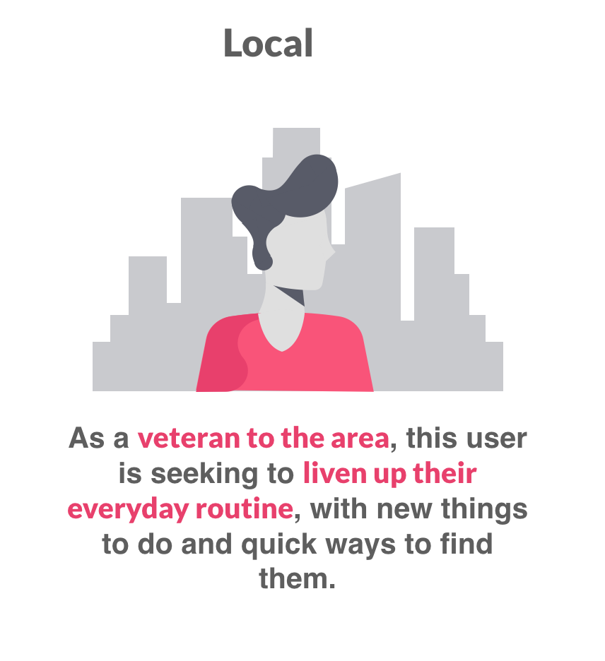
Users Profiles allowed us to break our large demographic into two more specific groups, focusing on more general details within the two groups. Using a combination of literature review, survey data, and conversations with our sponsor, we came up with the two general types of people String could target, regardless of specific details like age or gender. The two types are Local and Traveler.
Ideation
Using the data and resources we found during our research, as well as our User Profiles, we began to ideate what String could possibly look like. To do this to the best of our abilities, we proceeded in a unique pattern, which allowed us to ideate individually, as well as a group.
We began with Task flows. This allowed us to think of all the possible tasks, actions, and pages necessary to make String work. Moving forward with our flow in mind, we were able to ideate fairly quickly, using a converge-diverge ideation pattern,while maintaining a high level of quality.
Our sketches quickly became wireframes as moving from our second round of ideation, we were only focusing on the features that absolutely had to be there.
Task Flow
There are two kinds of flows that can be done within UX: User flows. and Task flows. A task flow is a single flow completed similarly by all users for a specific action. A user flow is the path a user follows through an application. For our purposes, and less confusion, we’ve decided to call what we’ve done “task flows.” This is because they combine the user flow and task flow together to help understand the overall flow we imagined for String.
Mapping this out allowed us to eliminate all the unnecessary clutter from our vision, and focus on what could really set string apart from its competitors.
Sketches
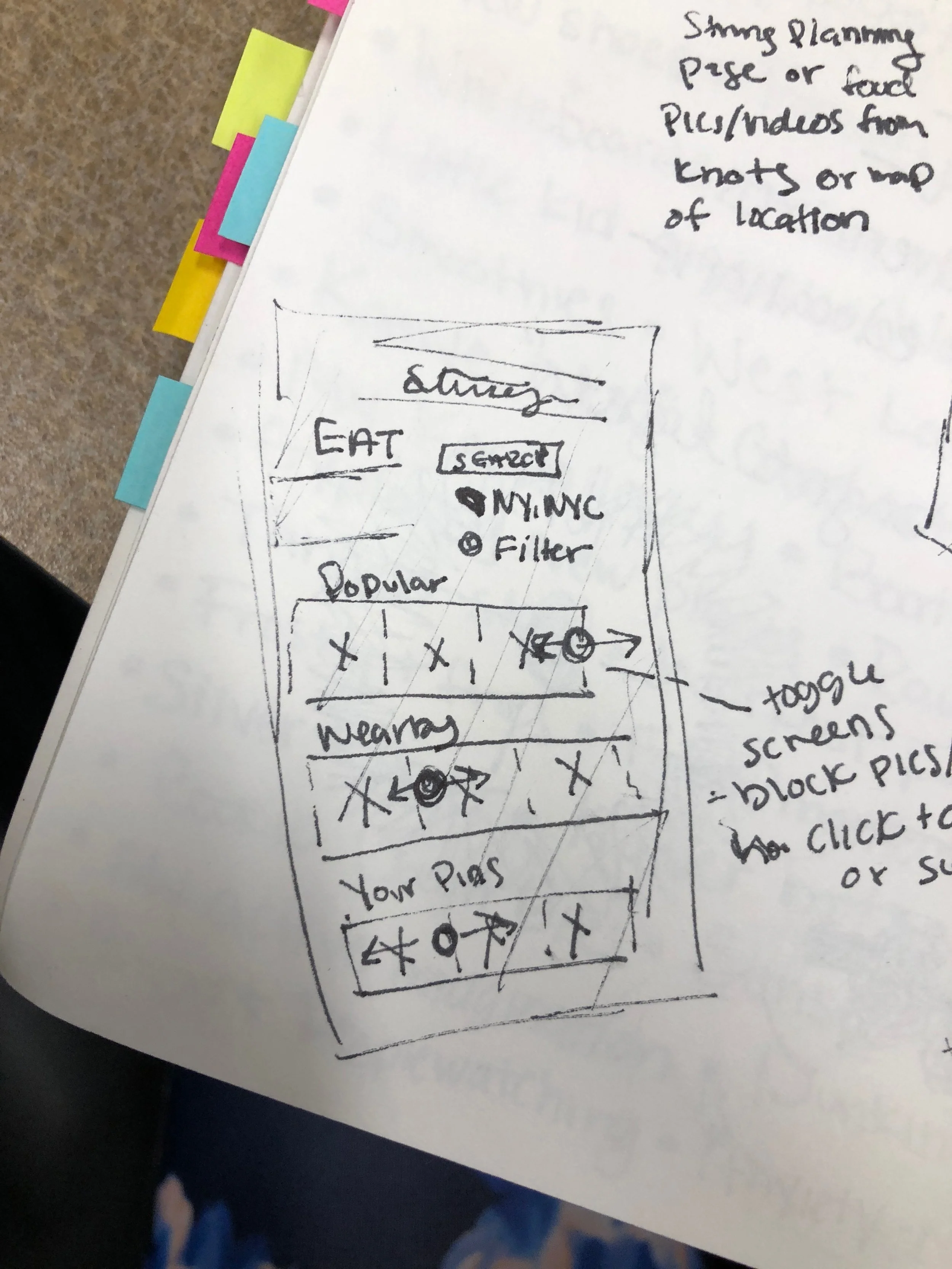
To begin our sketching phase of design for each interface, the team did a diverge--converge exercise. We executed this the exercise by setting a timer for about 10 minutes and then team members would sketch solo during that time, making rough layout sketches of any and all ideas they had for interfaces. Then, the team would and discuss the sketches, noting repeating themes and similarities across the solo sketches.
Outside of class and over the weekends, our team would create more detailed solo sketches with more specific details on the interface, keeping in mind the discussion the team had over the rough sketches in class. These sketches would then be brought into class and discussed as a team, yet again noting repeating themes and similarities across the sketches as a whole.
Finally, the team would come together and form a rough skeleton of what we wanted the interface layout to look like, using common themes we found in the solo sketches as well as any new ideas that the group came up with during the discussion.
From our task flow, we knew we had 4 main pages and each page had different functions associated with them. Our sketches drew upon the then current heavily social media trends and helped us to create pages that were quickly recognizable.
Below are the some of the sketches contributed by team members.
Wireframes
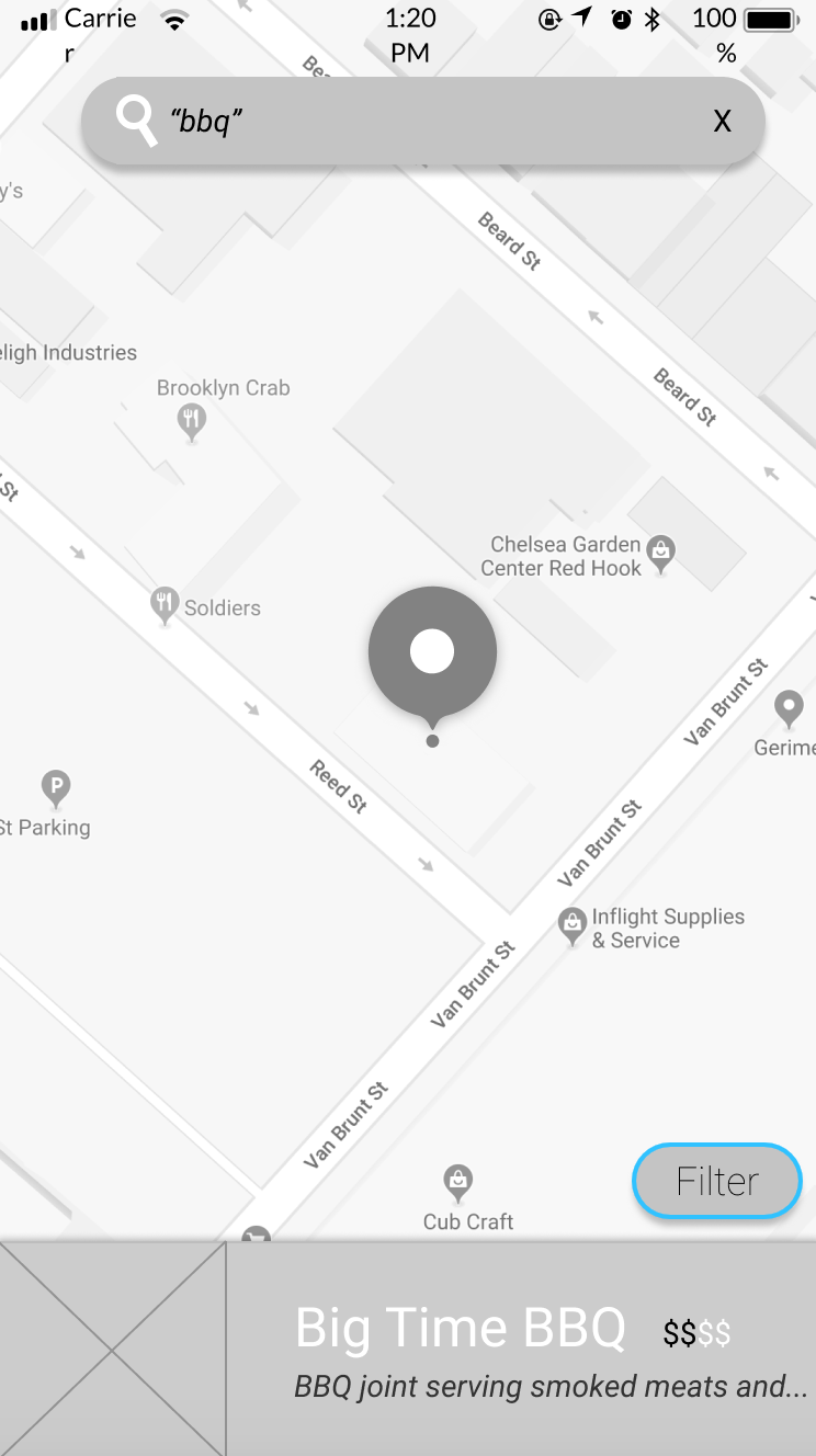
Following our ideation phases, each page was then taken into Figma to create a basic wireframe. Figma is an online collaborative design tool, like Sketch or Photoshop, that allowed us to quickly create iterations of the skeleton pages created during our group discussions.
Each page had multiple versions and iterations, much like our sketches.
Testing
We had three goals for testing:
Pain points
Familiarity
Layout
Each of the four main pages was tested with numerous individuals in and around Purdue’s main campus in West Lafayette, Indiana.
The changes that our users pointed out were quickly highlighted on Figma, and then under went ideation as how to fix them moving into a High Fidelity mock-up.
Design System
Companies like Airbnb, Uber, and IBM have changed the ways they design digital products by incorporating their own unique design systems. A design system is a collection of reusable components, guided by clear standards, that can be assembled together to build any number of applications. This includes, but is not limited to, the fonts, color scheme, spacing, and logo.
We decided to create a design system because as an app, String will be used across multiple platforms, like iOS and Android. The basics of the design system were created with the intention of making a universal brand across all platforms which reflect the playful, yet mature nature.
Color Inspiration
To help us decide on a color scheme for String, we each provided pictures of anything that we found inspirational and cool. All the photos that we found had unique color palettes, tones and emotions. The following pictures are the ones we ended up basing our color palette on. We think they reflect the playful, yet mature nature that String needed, while also being a little more artistic and bold.
Colors
When picking a color scheme, we wanted to choose colors which were bright yet not too distracting. This is because String is a social media app, so there will be plenty of other colors from the images which users upload. The colors shown below are both playful and bright, yet cohesive enough that they will not distract from the users’ images.
Fonts
We focused on choosing sans-serif fonts, as these often have the connotation of being more casual and modern. We did this because String will be an extremely new and potentially confusing app, so we wanted to make users more comfortable wherever possible.
The reason we chose to utilize these specific fonts opposed to the iOS and Android default sans-serif fonts is because we felt that Avenir and Helvetica Neue better represented our goal.
Final Concept
Below are the final concepts for some of the pages within the String app. Notably, the colors from our color palette are absent in some concepts because we believe these pages need more refinement and testing.
Summary
This project was unique and amazing experience. I also got the to work with a great team full of amazing individuals. I couldn't be more proud of my co-leads and the underclassmen we had on our team. We asked a lot of them, and they came through with a high level of quality. Being able to build the screens for this app from the ground up was an interesting experience because of the approach we took in designing them. This project was also unique in the sense that we were able to have complete creative freedom over this app and we were able to heavily draw inspiration from current popular applications and trends.
Thank you to George Brooks and Landon Young of Crema Labs for this opportunity.


